Nextdoor's Heisensubscribe
(And Other Dark Patterns)
TL;DR: Nextdoor's notification settings are hostile. This is not an isolated incident.
"See What You Missed"
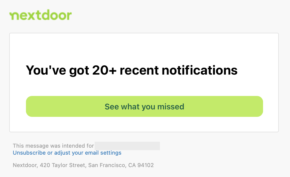
Send emails that demonstrate immediate and obvious value.
My email client renders HTML and CSS -- show me what I missed.
Of course it's easier to send a static link to a notification page. Rendering dynamic emails is non-trivial.
But as it stands, this email reeks of "FOMO" and "driving engagement".
Don't sully your brand for cheap clicks.
Email Frequency
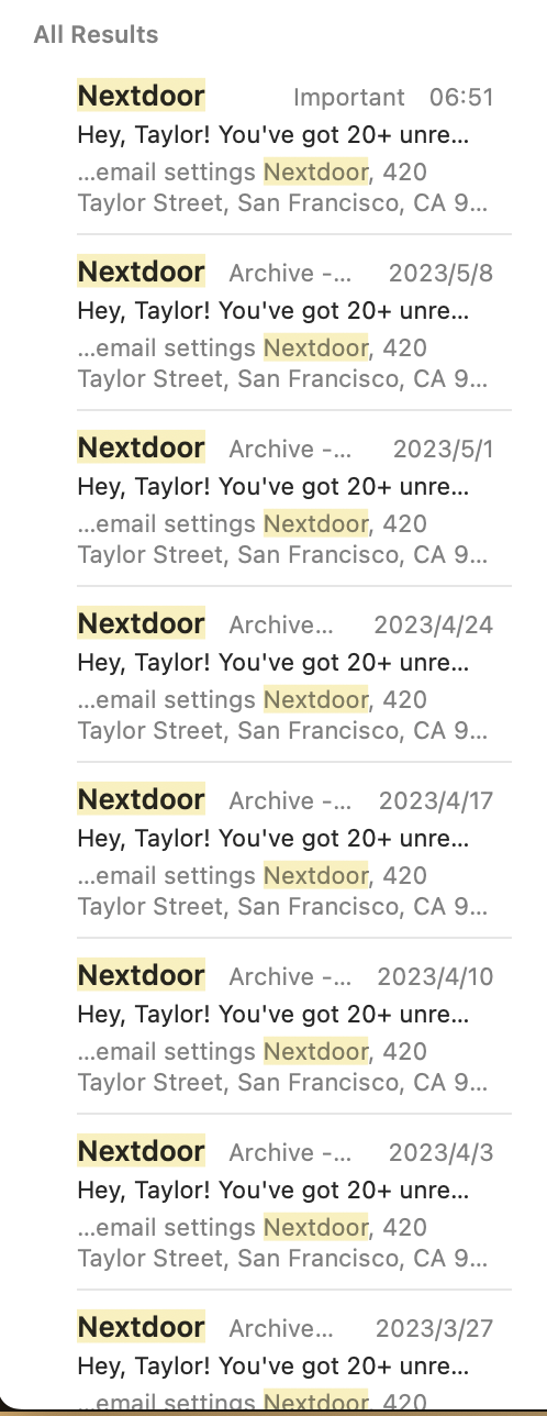
Monthly emails can be overlooked, but weekly emails can overwhelm.
If you're going to blast weekly emails, please offer a monthly setting.
Furthermore, throw a "send this email monthly instead" link in the footer. Put affordances in context.
Heisensubscribe
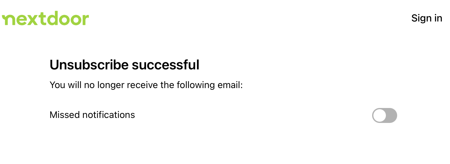
Did I unsubscribe?
Unlabeled switches obfuscate intent:
- "yes, you will recieve more of these emails"
- "yes, you unsubscribed"
Don't put any controls on unsubscribe pages. Visually communicate to me that there is no remaining work for me to do. Simply say "unsubscribe successful" and add a link to my notification settings.
"Just One Setting"

Wait a second.
If this setting is called "Missed notifications", does that imply others exist?
I'm suspicious of you, nextdoor. You know that I probably want to unsubscribe from everything, but you're being a sore loser. Add an extra link that says "unsubscribe from everything".
Kicking and Screaming
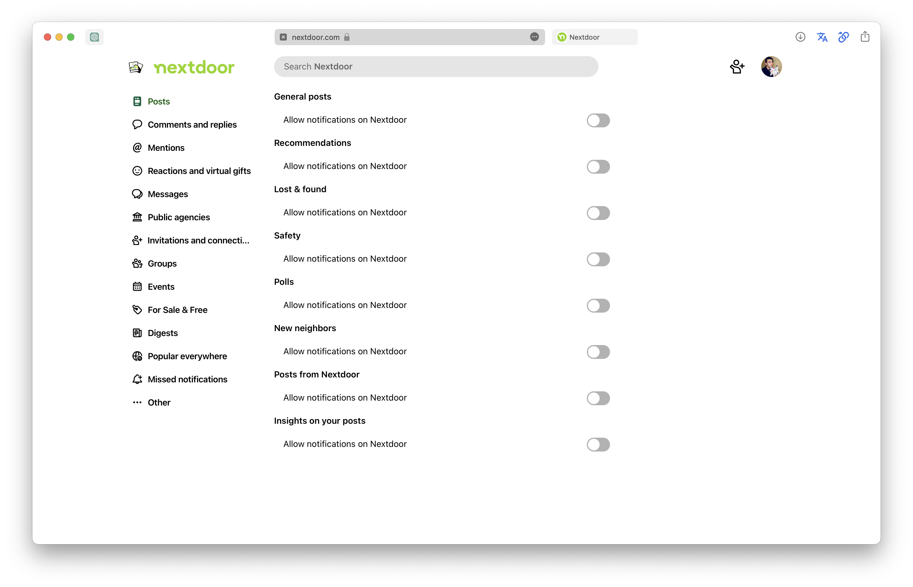
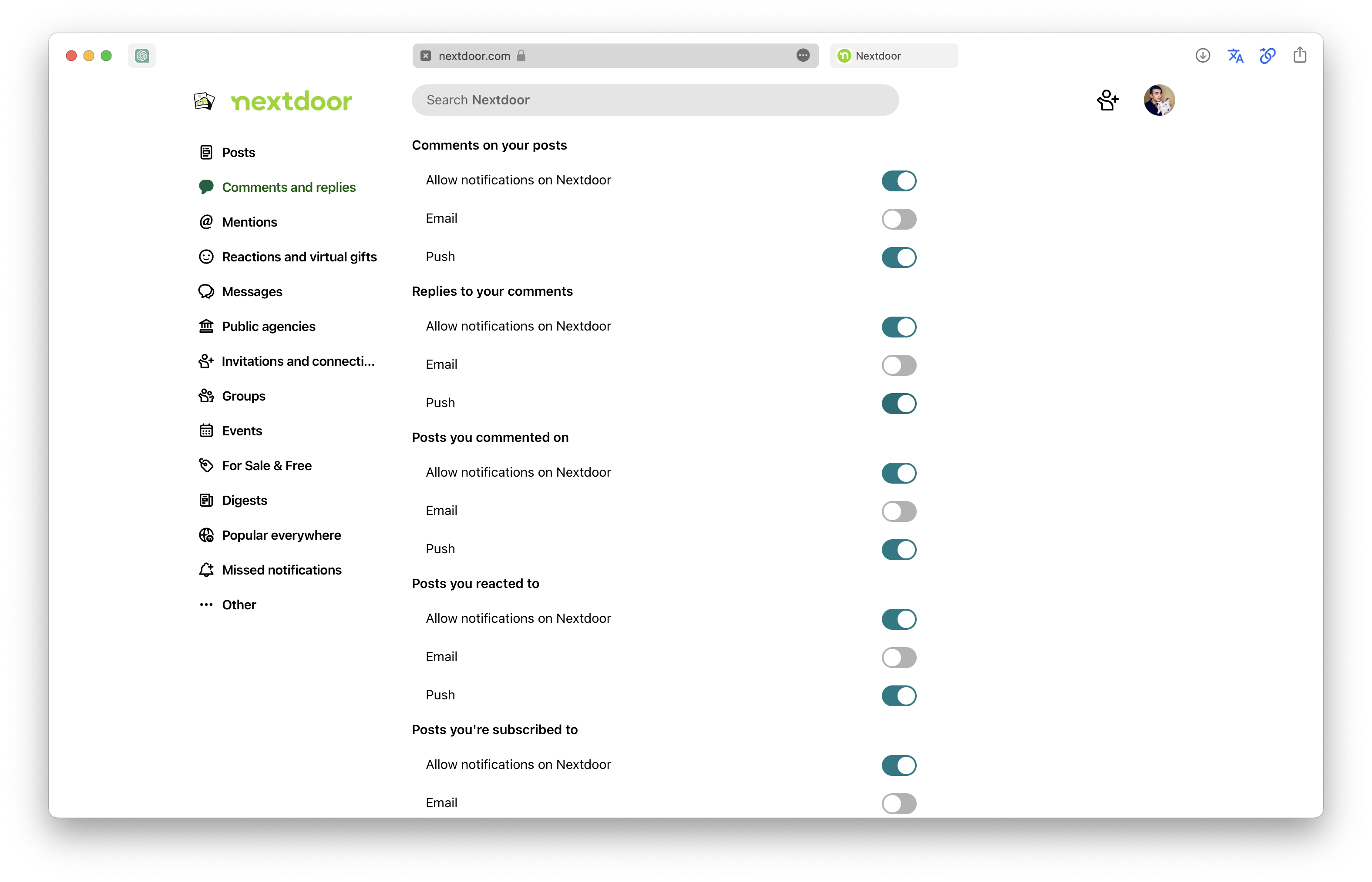
Yes, there are 16 pages of notification settings.
There are no "disable all" buttons. In order to unsubscribe from everything, nextdoor demands hundreds of clicks.
Shame on you, nextdoor.